CONTEXT
Reborn Clothing Co. specializes in vintage, up-cycled and reworked clothing and aims to help reduce landfill waste and demand for fast fashion. Reborn acts as a brick and mortar business and as well as an e-commerce store. Fast fashion can be defined as cheap, trendy clothing that ultimately involves overproduction, overconsumption, environmental damage, landfill waste and unethical business practices. This system needs to be changed. That’s where Reborn Clothing Co. comes in.
METHOD
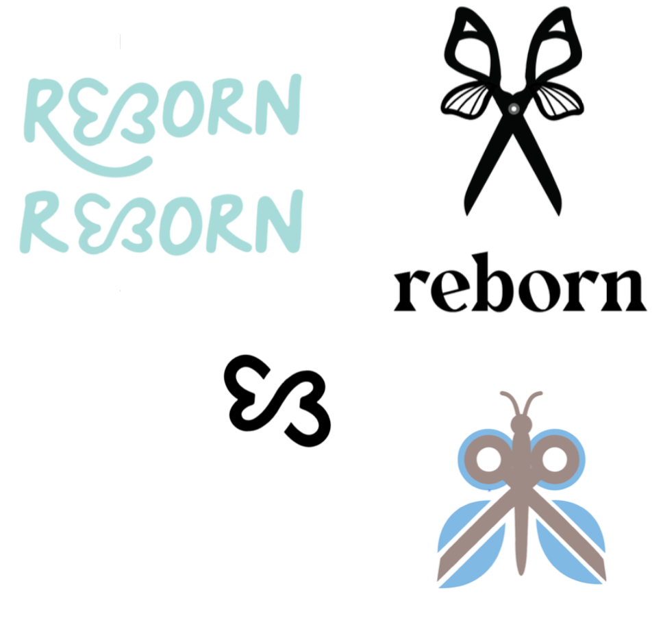
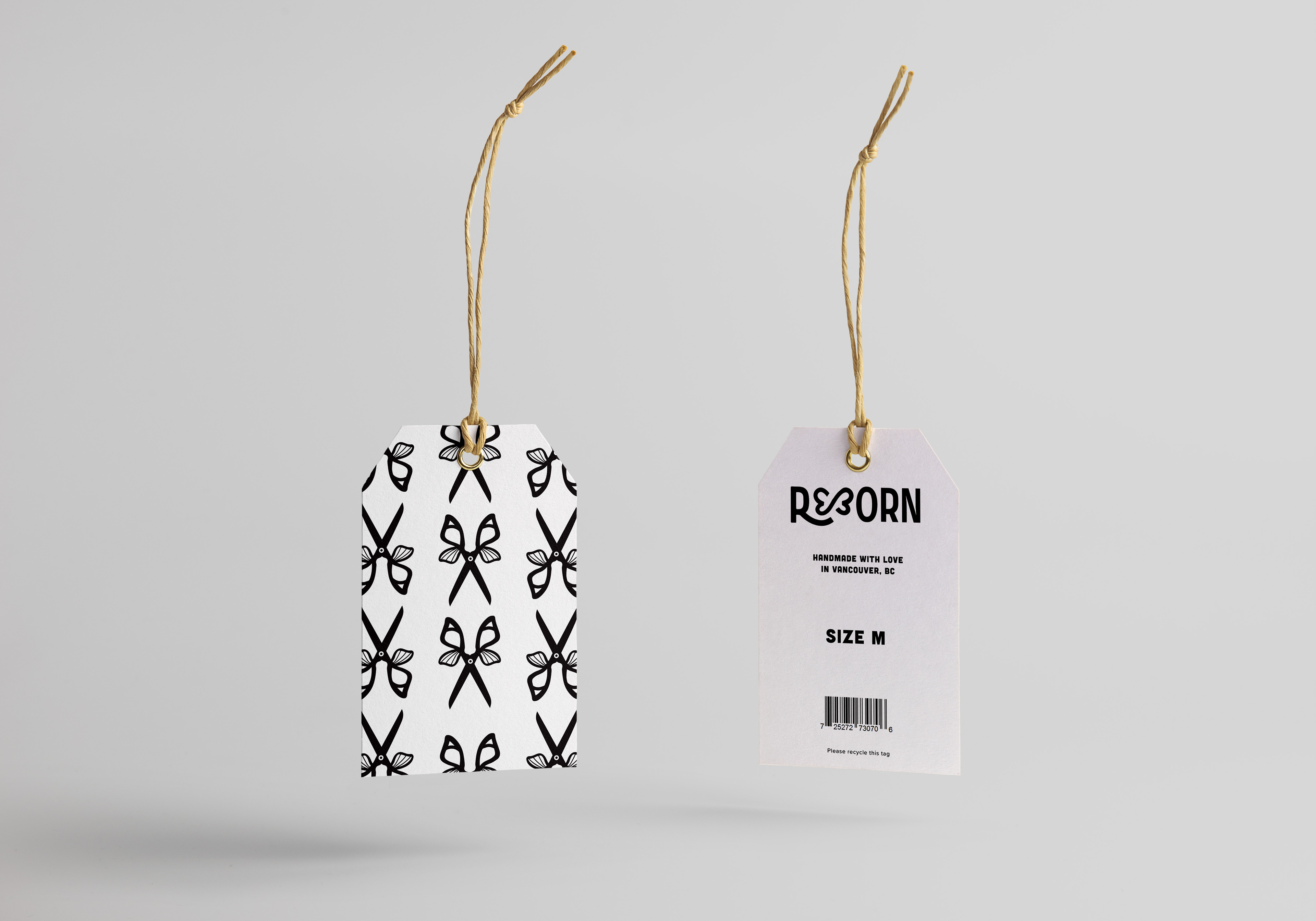
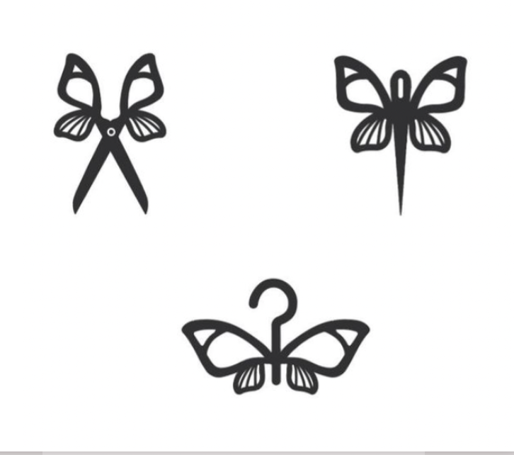
Reborn represents sustainability, innovation and creativity and the branding and marketing messages should reflect that. After researching and brainstorming ideas that relate back to recycling, repurposing and recreating, I’ve decided that the butterfly would be a perfect symbol for the brand. The butterfly often represents “new life” and “rebirth” which is quite literally what the brand is all about.
SOLUTION
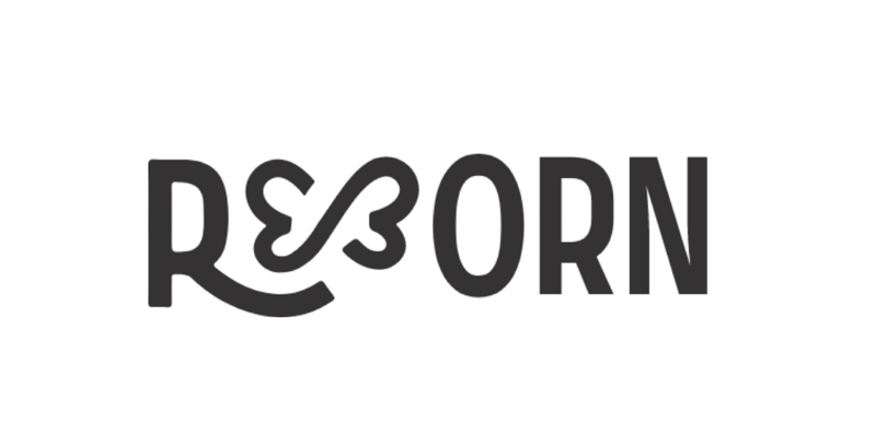
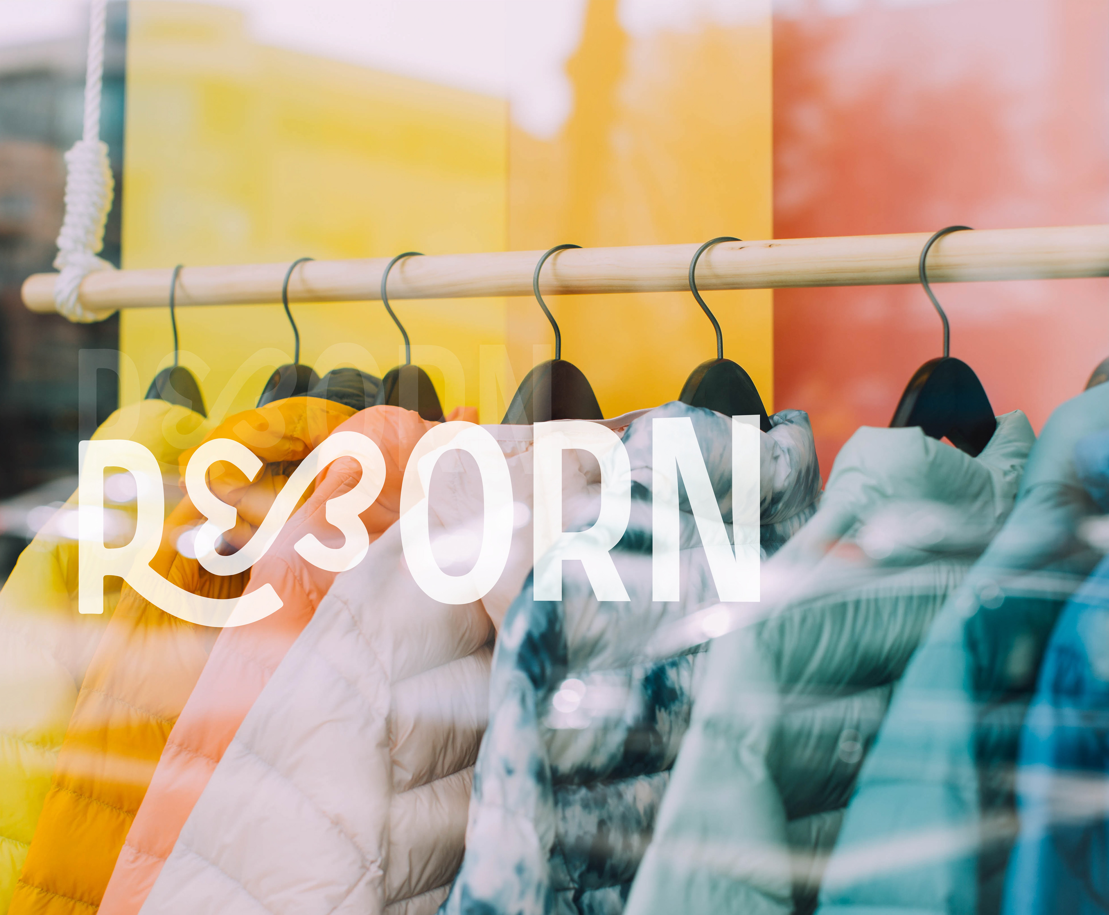
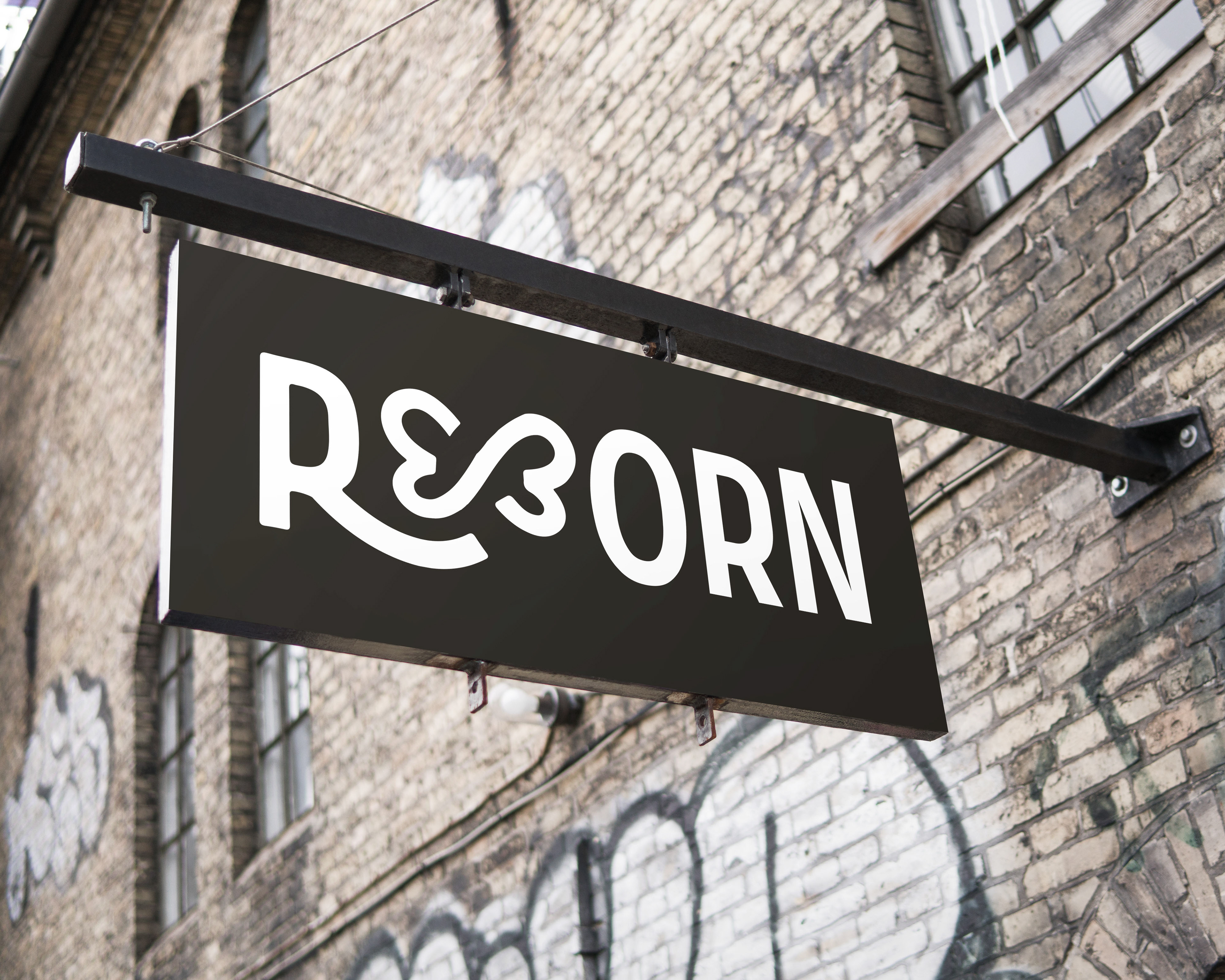
The Reborn logo encompasses everything the brand stands for: innovation, repurpose and creativity. The butterfly icon that creates the interconnecting “EB” letters is surely an eye-catching representation of the company’s essence and vibe. The free-flowing icon paired with the modern sans-serif type evokes a very approachable and youthful energy. The butterfly symbolism was carried over throughout many different elements of the brand such as patterns and iconography.
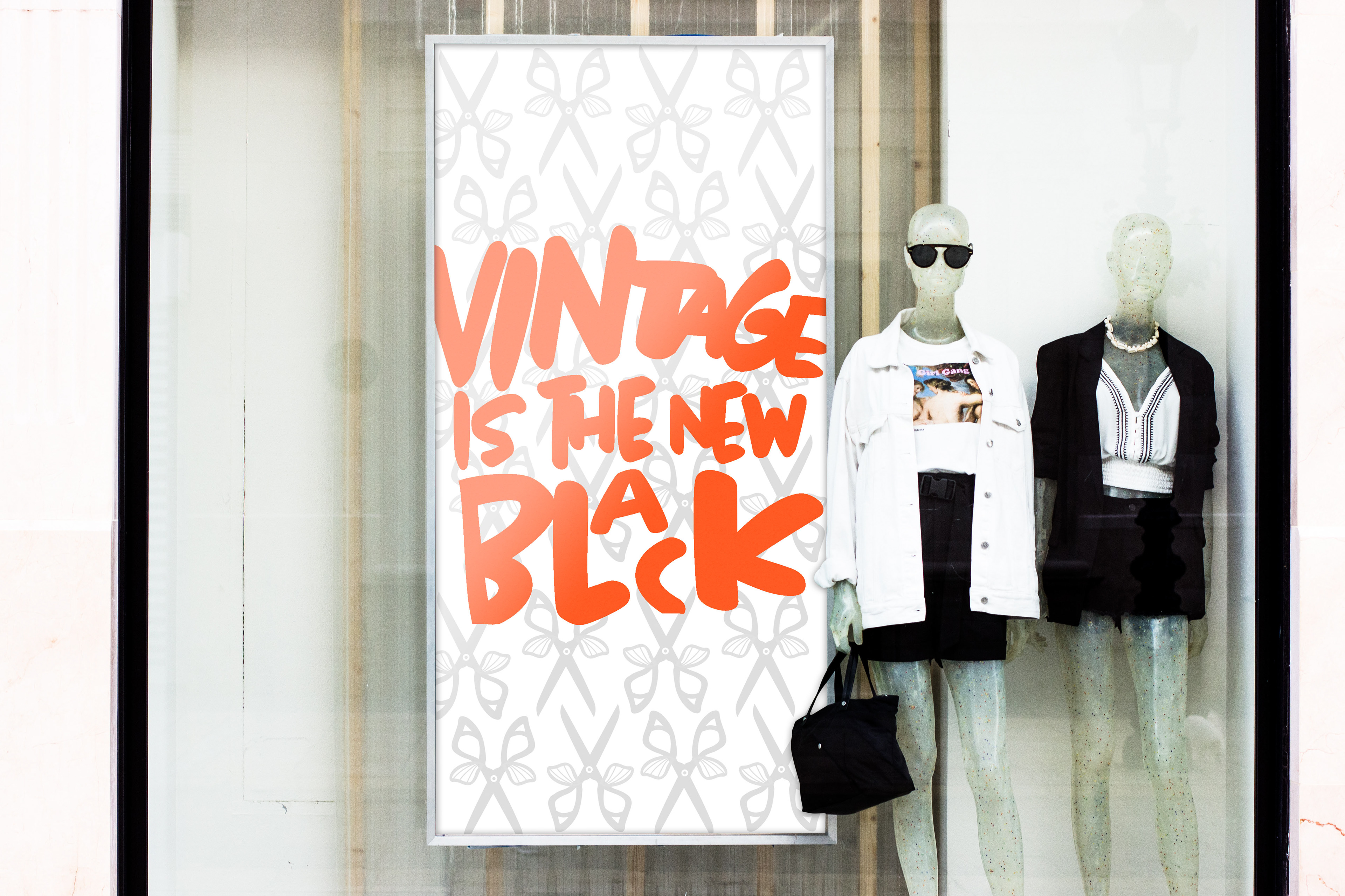
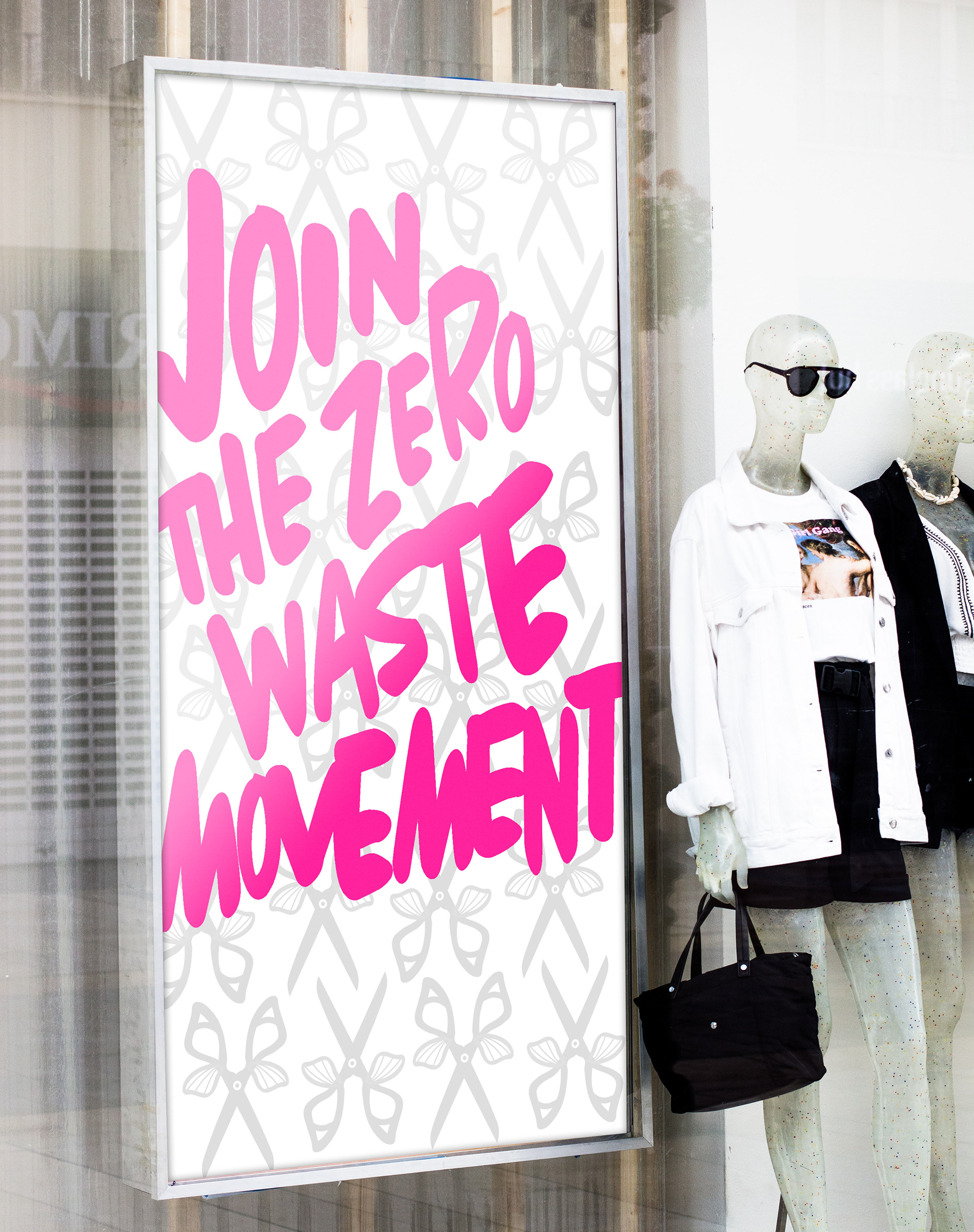
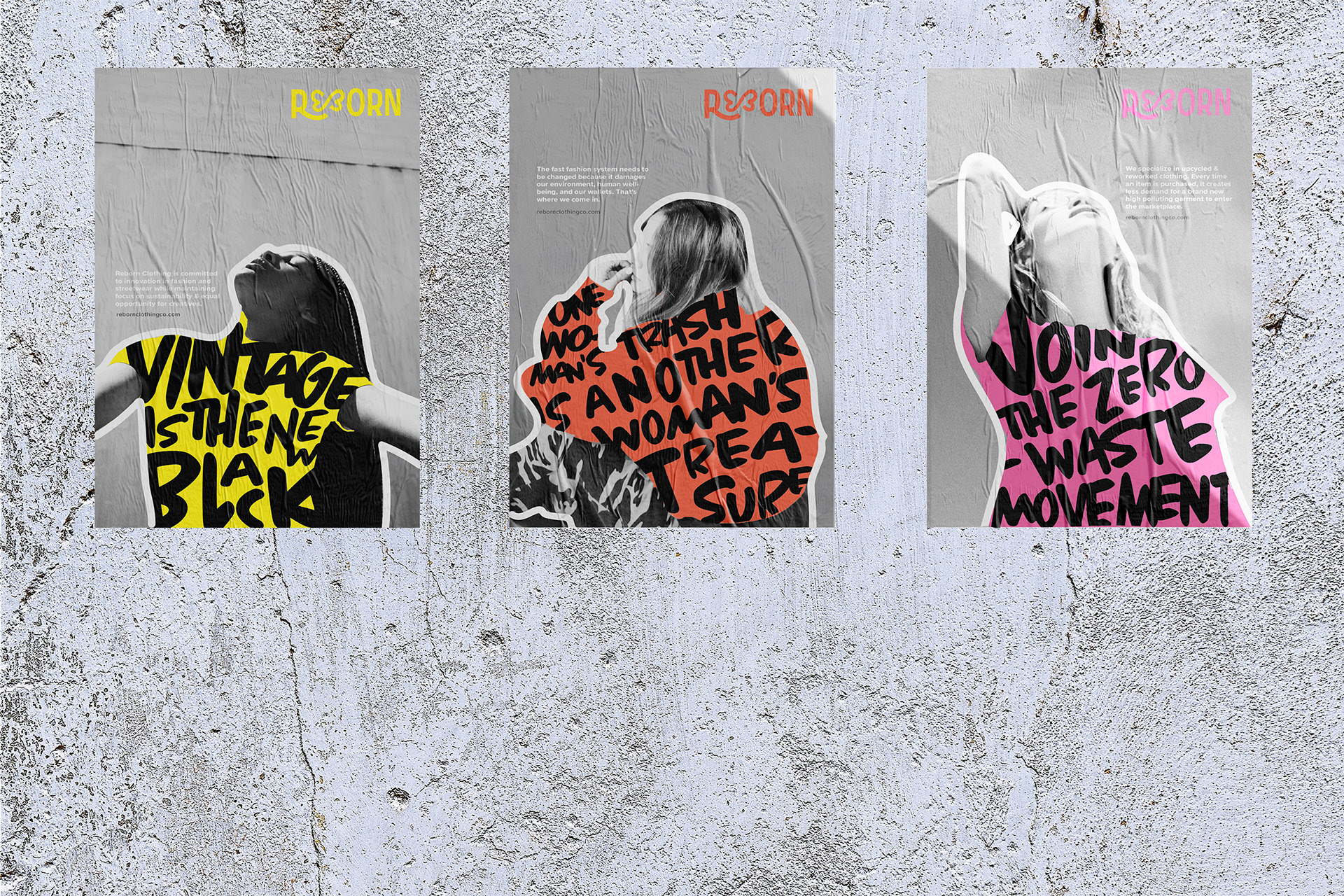
POSTER SERIES
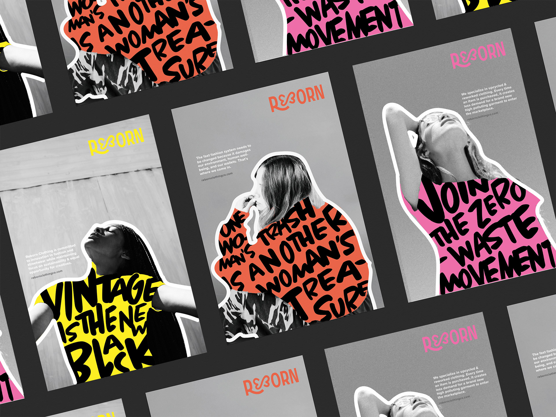
The look and feel reflects the DIY and handmade nature of Reborn’s products and the way they are unique. The bold and “in-your-face” design is very eye-catching and memorable which is very vital to create brand awareness. No products were shown in the posters because each and every garment is one-of-a-kind and bespoke. Instead, messages relating back to the core values are displayed where the garments would be. It shows that by supporting Reborn, you are supporting sustainable fashion and equal opportunity for local creatives in the city.
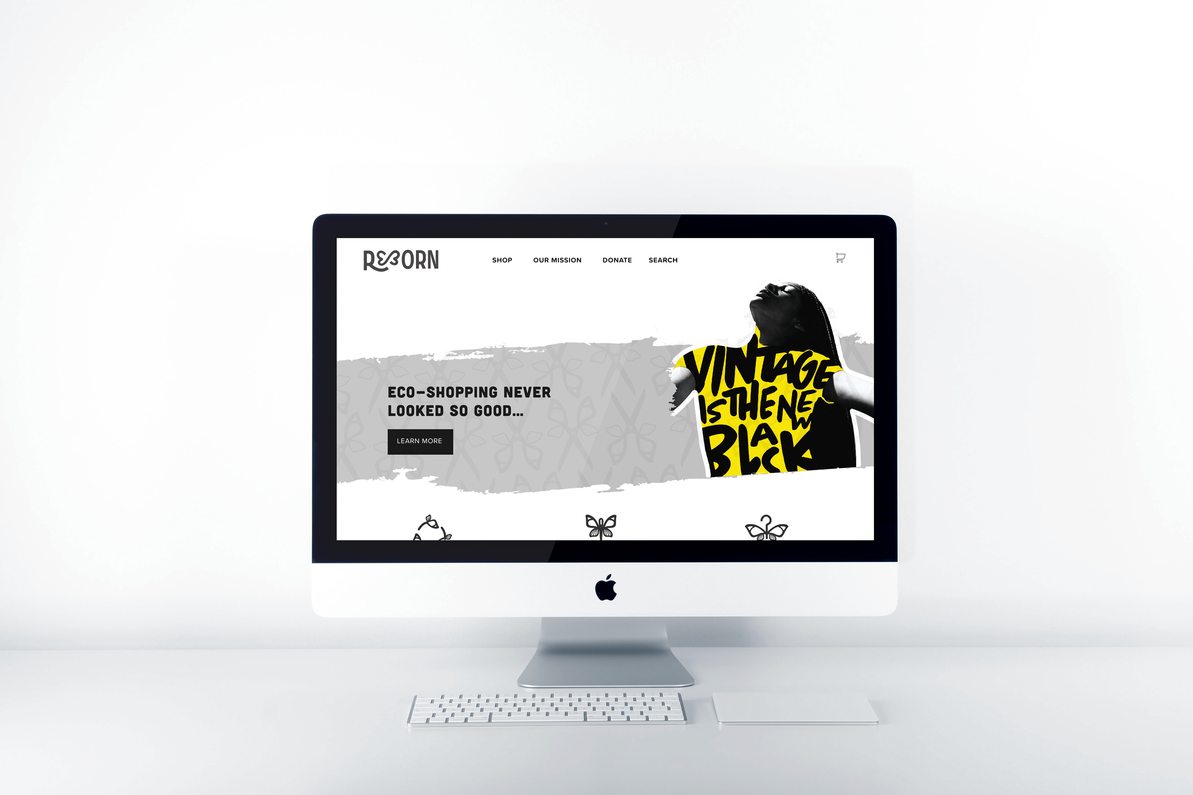
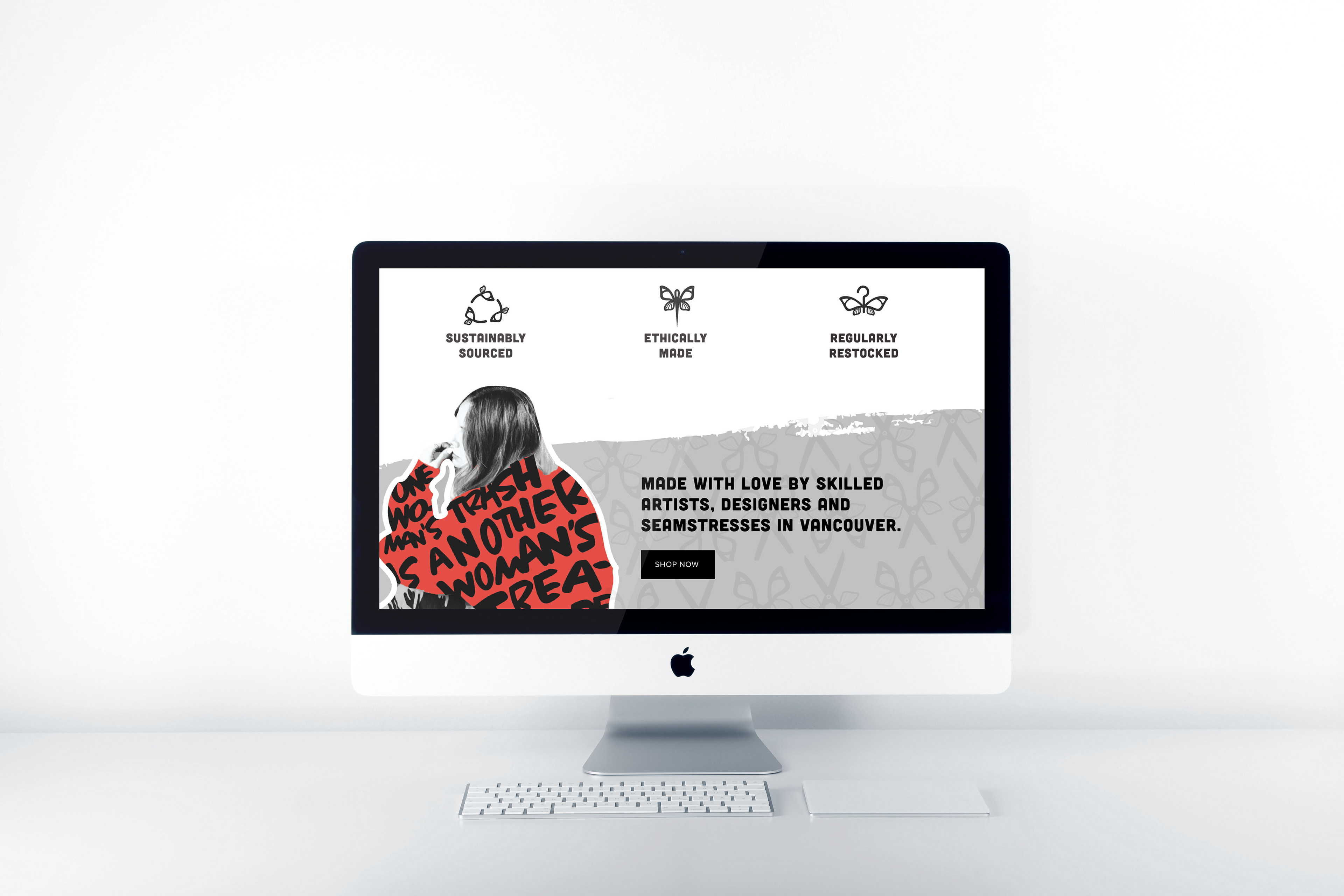
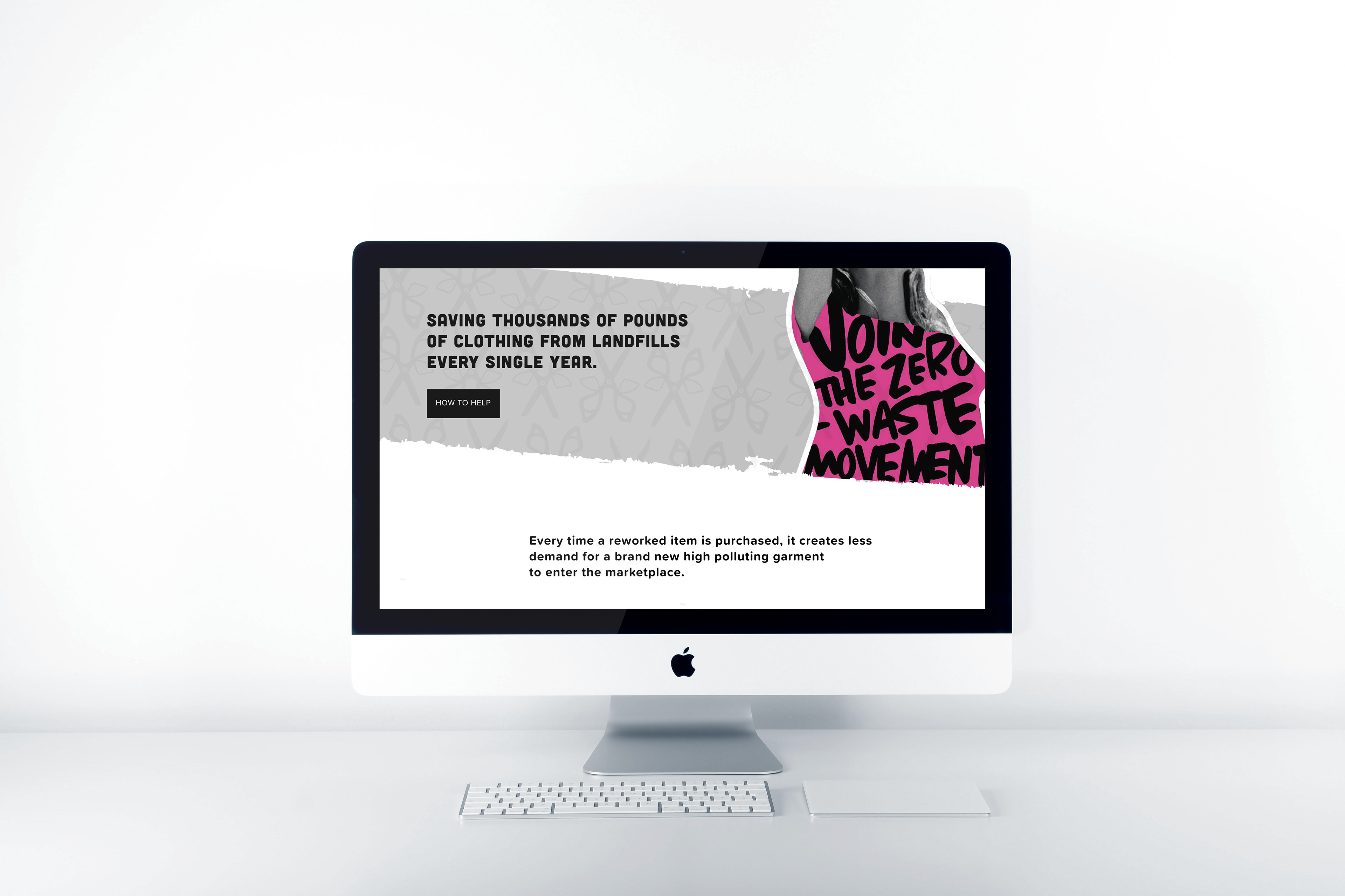
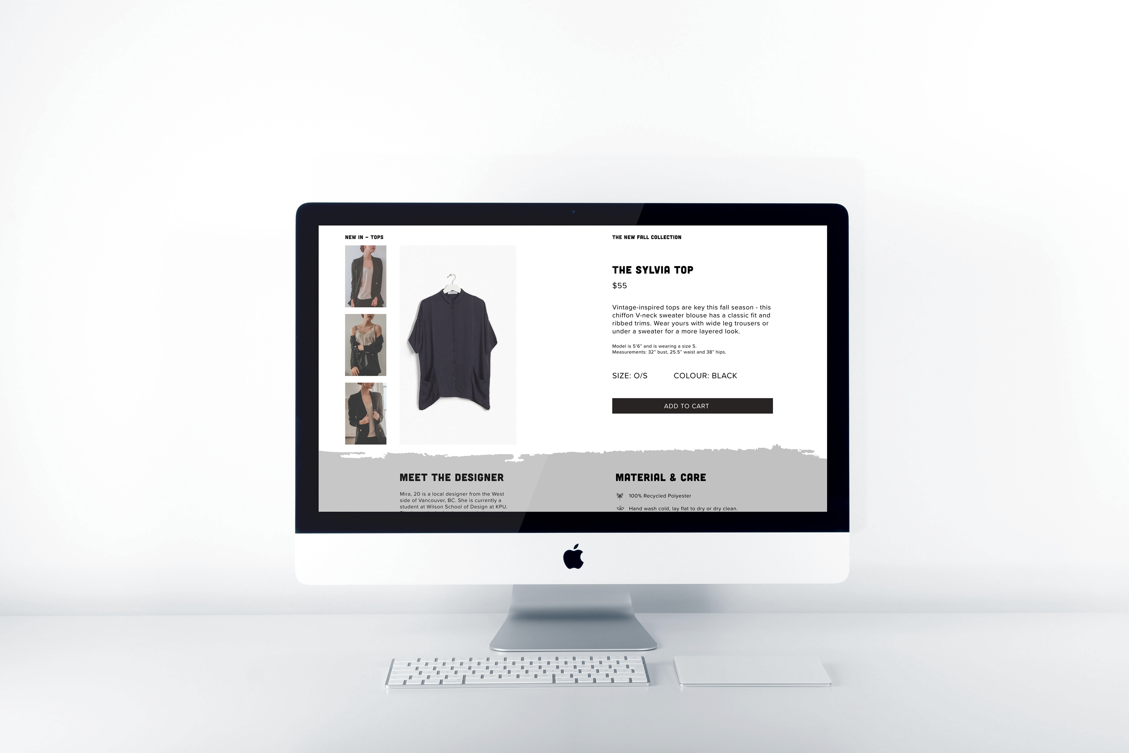
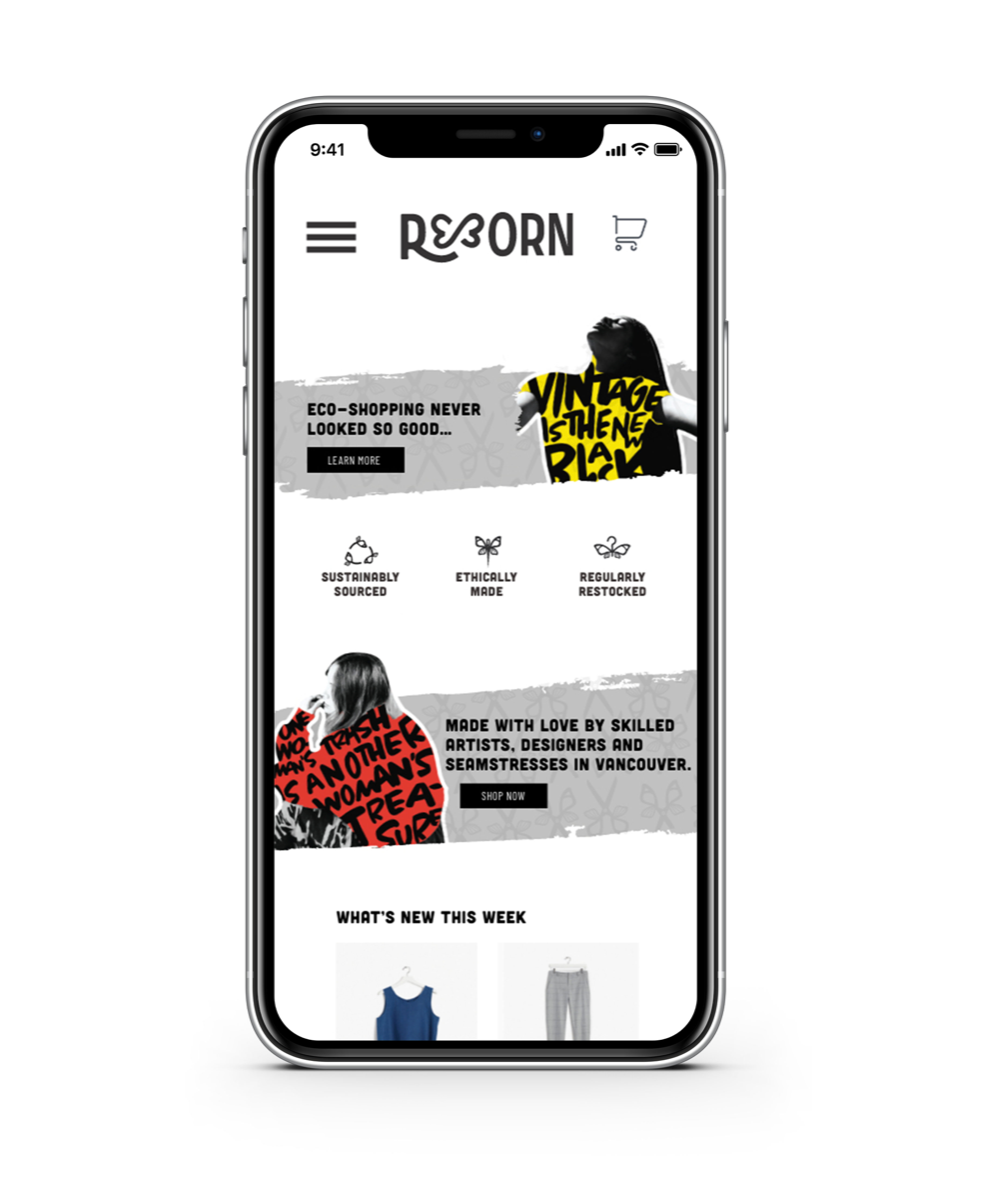
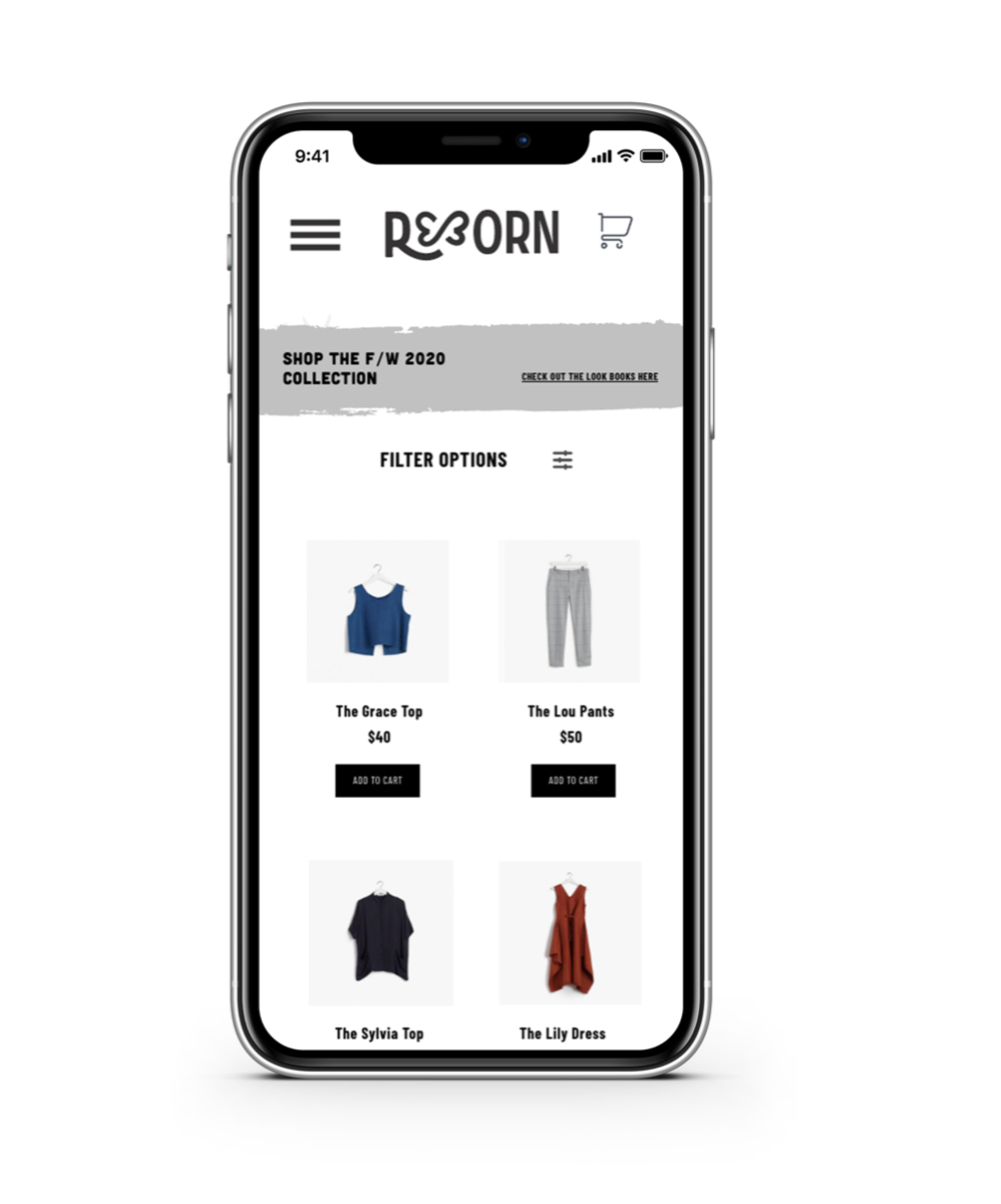
WEBSITE
The website serves as an informational centre and an e-commerce destination as well. It tells you a lot about the brand’s values and the impact of fast fashion and landfill waste. Products sold on the website range from tops and bottoms to accessories. The layout is very modern and clean with a hit of colour and energy from the imagery. It is meant to be very user-friendly and straightforward. The brand’s butterfly iconography was carried on throughout the site as well.
TAKEAWAYS
A key takeaway from this project is the importance of doing enough research in order to create strong brand messaging. With a cause in mind and research/facts to back it up, the design goes beyond the surface and compels the consumers to think twice about the way they purchase clothing. Introducing catchy messaging or visually striking imagery within the brand materials can also help attract and intrigue more of the target audience.