KEY is the most innovative, high-volume, pre-construction real estate marketing and sales brokerage in Western Canada with a proven history of record-breaking sellout success. Located in Vancouver, KEY Marketing and its team have marketed and sold over $8 billion worth of real estate across British Columbia.
As Corporate Graphic Designer at KEY, I helped elevate the brand's image and strategy, as well as spearheaded many different projects such as the website, team apparel, promotional materials and social media content
WEBSITE DESIGN
KEY Website Homepage
Taking inspiration from fashion editorials, clean textures and magazine layouts, the Key Website was designed with sophistication and minimalism in mind. It is meant to be user-friendly yet eye-catching with compelling visuals and bold typography. The website all throughout mirrors Key's brand image and overall vision.
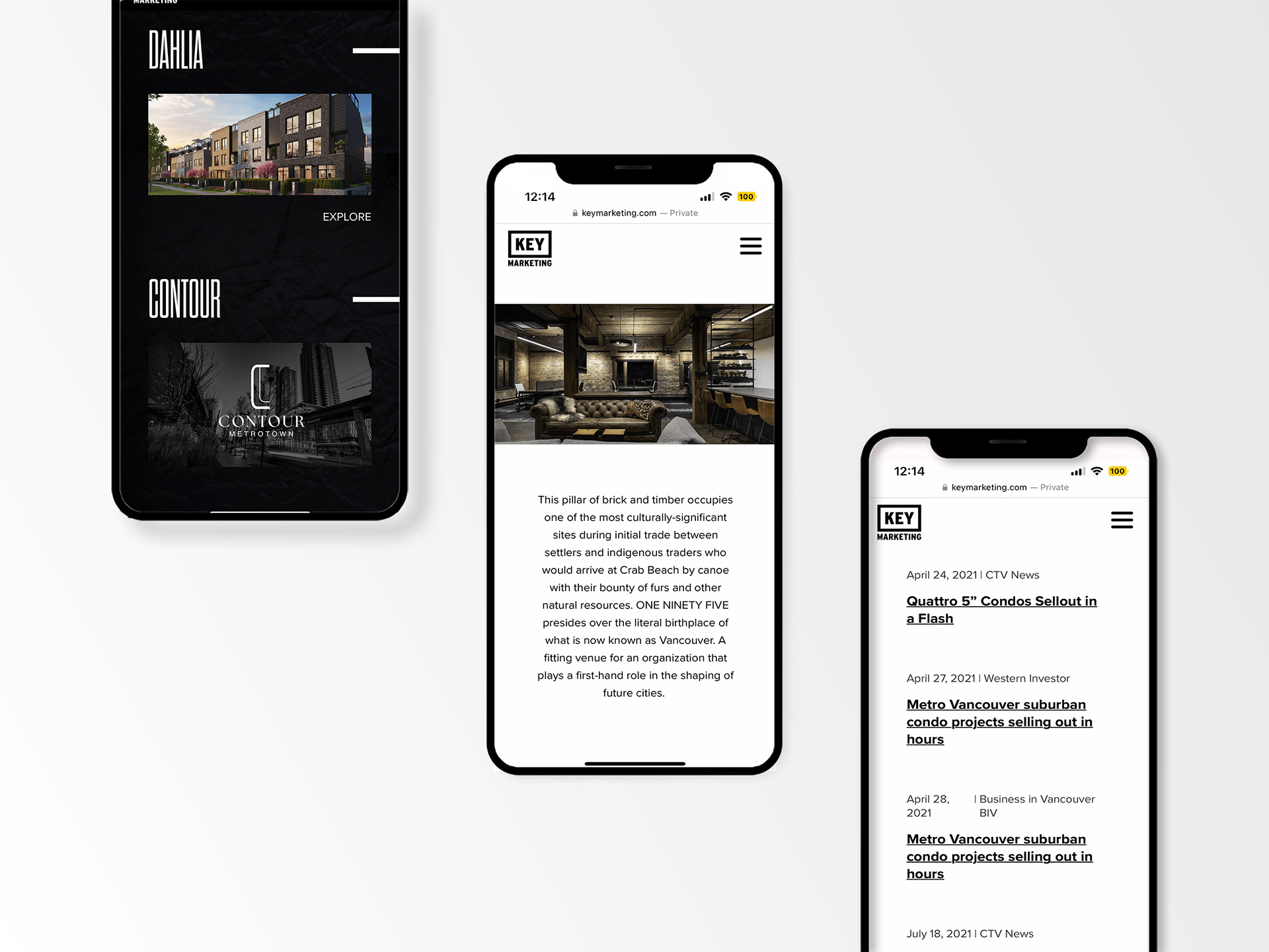
Before I joined Key, they didn't have a proper site or any cohesive brand materials so I was brought on to reimagine their visuals and content, combined with their vision and my own personal style.
SOCIAL MEDIA

The content and style of Key's socials are cohesive with the website. The compelling photography and bold typography are the highlights of the posts. The content alternates between a black and white theme in order to create an interesting visual dynamic within the grid.
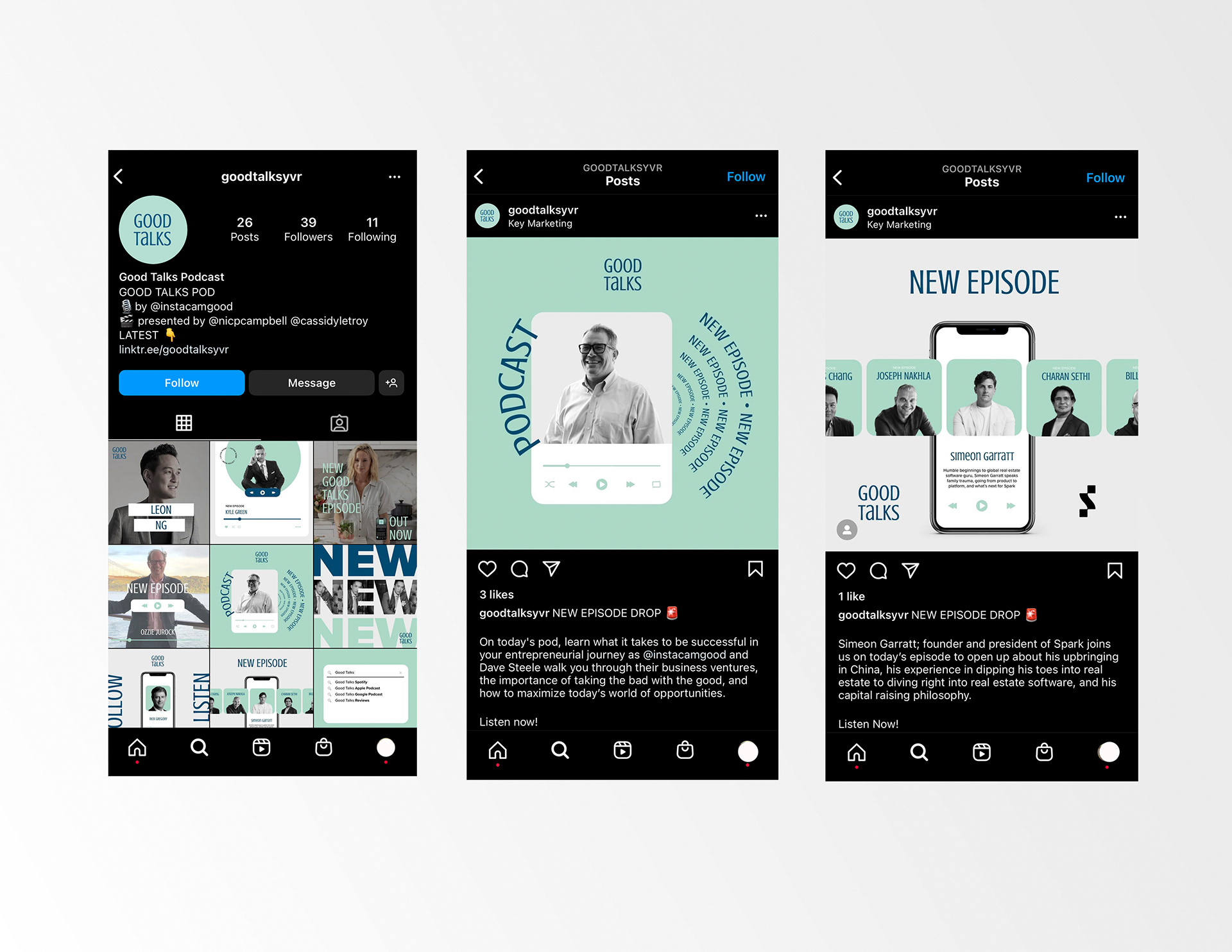
I also created visuals for Good Talks, a sub-brand of Key Marketing. Good Talks is a podcast hosted by Key's CEO, Cam Good. Every week he catches up with entrepreneurs and industry experts to give insight into their minds and the world of real estate.
The idea was to visually represent the podcast's vibe and approachable nature. The signature teal green colour combined with the simple graphic elements capture the viewer's attention.
PROMOTIONAL MATERIALS
Besides web and social media design, I also crafted various promotional materials for Key such as team apparel, hats, pins and stickers. The items unique to the brand are the ones that stand out the most like the annual "tour" shirt and the Key Secret Sauce. I was able to play with various new elements and think outside the box in order to elevate the brand even further. These items were made exclusively for the Key team and their clients.
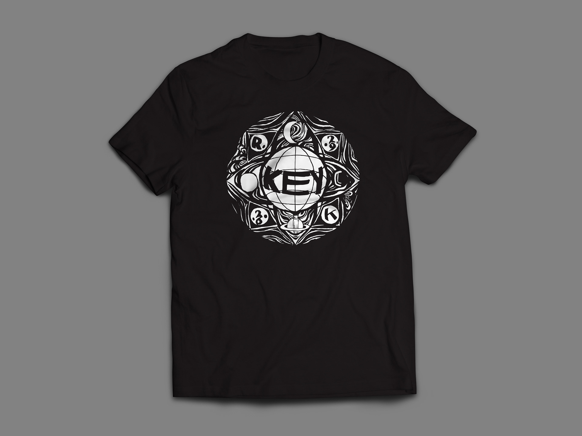
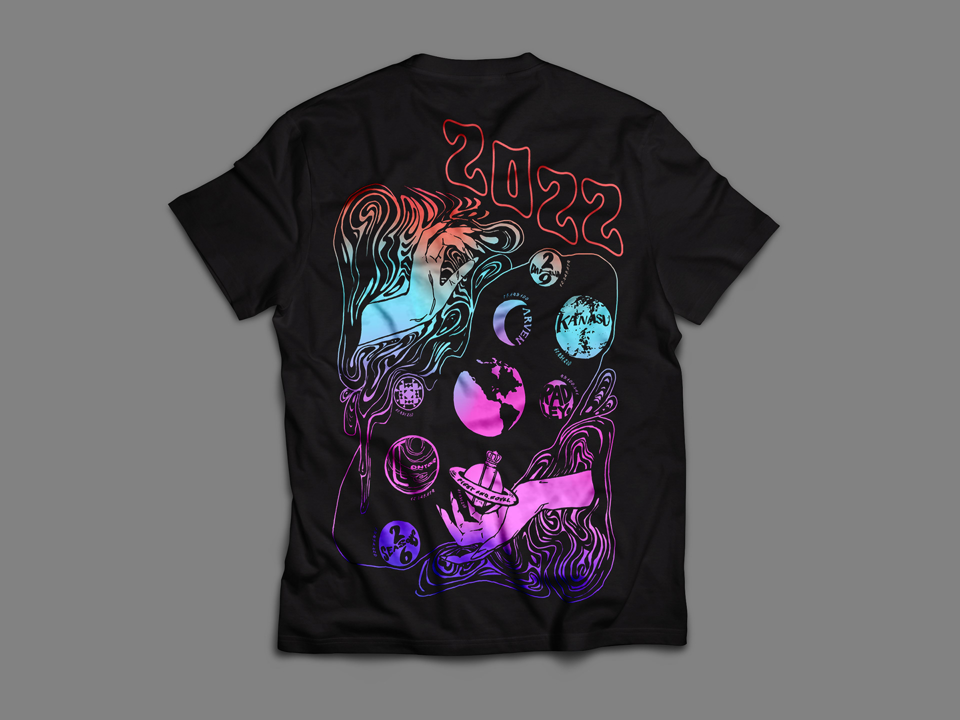
The Key "tour" shirt was a project conceptualized by the company's CEO. The idea was to create a team shirt that encapsulates Key's achievements and sellouts from the year. The visuals would take inspiration from vintage rock and psychedelic graphic tees, hence coining the term "Key Tour Shirt".
2022's theme was inspired by the galaxy, space and planets. The psychedelic theme is evident through the shirt's bright colours, mandala graphic and free flowing illustrations. The planets are meant to represent the various projects Key has worked on this year. The graphics were designed in collaboration with a local artist, Alex Delos Reyes.
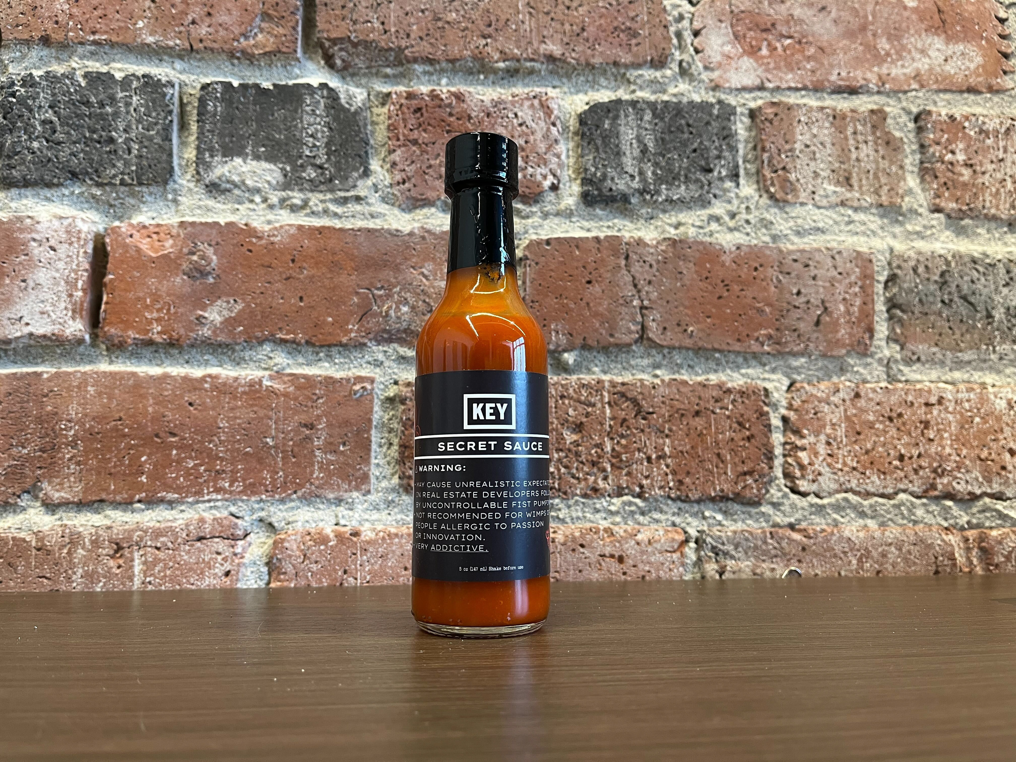
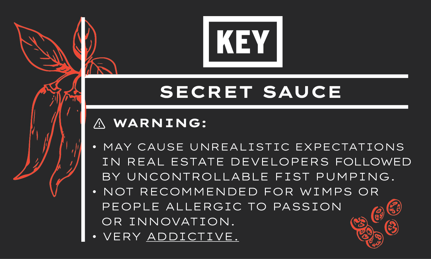
The Key Secret Sauce is one of Key's other quirky promotional items. The idea was conceived after several clients have asked the company, "How do you maintain success, what is your secret sauce?" So in response to that, I've created an actual "secret sauce" to hand to them. The marketing team and I, along with the CEO crafted a unique custom hot sauce that encapsulates the brand's vibe as a whole. We tossed in bacon, bourbon, honey, saffron and everything in between. The clients were thrilled and amused!
The label design mirrors Key's overall brand and style, taking inspiration from both the website and social media content. The copy was meant to reflect the company's success while also poking fun at themselves.