
2021 ADCC BRONZE WINNER - STUDENT COMPETITION (DESIGN)
2020 RGD AWARDS FINALIST - AWARD FOR PACKAGING DESIGN (SERIES)

CONTEXT
Folkhouse Brewery is a fictional local cooperative brewery in Vancouver, BC. It serves as a communal space where brewers and beer connoisseurs come together to learn and enjoy quality craft beers. Folkhouse’s core values are centered on community, collaboration and locality. At Folkhouse, they celebrate the people. Nothing’s truer to who they are than letting their specialty craft beers reflect Vancouver’s vibrant and diverse community.
METHOD
Folkhouse at its core is a company that is all about connectivity and collaboration. The brand identity should represent that in some way but at the same time be memorable and easily recognizable. The logo should be simple and unique while evoking Folkhouse’s core values. It is imperative that the beer series encapsulate the spirit of Folkhouse and their community. Since the craft beer industry is overly saturated with funky and kitschy illustrations, the overall brand aesthetic should have a human-like feel but with a modern and clean twist.

THE LOGO
The Folkhouse logo is centered around connectivity. With the interconnecting letters and bold typography, it is surely an eye-catching representation of the brewery’s spirit and identity. The logo is also free-flowing , organic and is very reminiscent of the brand’s vibe as well. The simplification of the monogram “FH” is very modern and memorable.

BEER SERIES
Introducing the limited edition “Meet the Gang” beer series. This series pokes fun at some of the most common and slightly “stereotypical” subcultures that walk the breezy Vancouver streets. Since Folkhouse is all about community and inclusivity, it only makes sense to center the packaging around the people. The 3 beers in this series were inspired by the hipster, hypebeast and herbivore, typical archetypes in the local community who frequent the breweries.
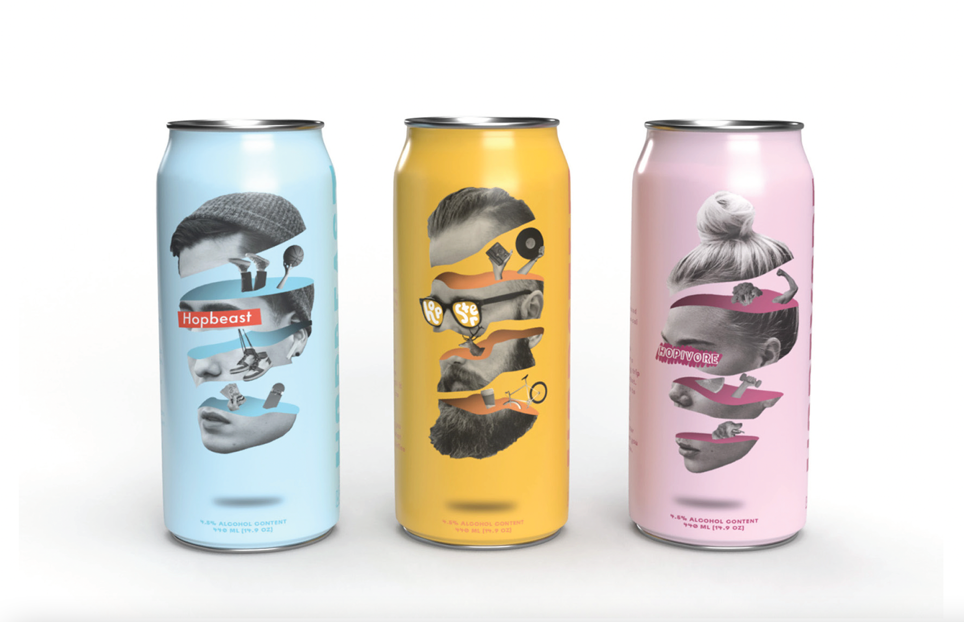
The Hopster is a West Coast IPA, crafted by the finest, plaid shirt wearing, mustache donning brewers. With mellow hints of citrus and coriander, this will be your new favourite beer… until it gets too popular to be cool. The Hopbeast is the new kid on the block, our twist on the hazy pale ale. Bright aromas from its tropical notes hit right when you grab the glass, like unboxing a fresh pair of sneakers. The Hopivore, your friendly neighbourhood health buff is a low-cal kettle sour. The perfect beer to come home to after a long jog or shopping trip at the farmer’s market. You don’t even have to wait ‘til cheat day.

The photo collage/photo manipulation approach is very quirky and evokes a very DIY and human feel. They are reminiscent of paper cutouts and scrapbook pages. Each beer can embodies their specific persona and everything related to that. The graphic represents breaking down the archetype and peeling back the layers to reveal the person behind the surface.
TAKEAWAYS
A key takeaway from this project is the importance of telling a compelling story that ties in with the concept. With a story, the design takes the target market (in this case, the craft beer enthusiasts) beyond the surface and allows them to resonate more deeply with it. Introducing personas or characters within the beer can designs can help connect with the audience more and add a relatable element.