
Dank Mart is a Vancouver-based snack shop known for its limited-edition, rare and out-of-this-world treats.
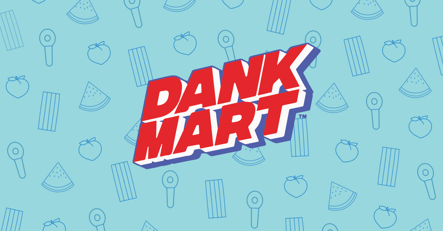
The "Dank Pack" was a project in collaboration with Dank Mart's creative team. The goal was to design gummy candy packaging that aligns with the brand's vibe and aesthetic. I was brought on board to create eccentric and fun illustrations that elevate the product.
INITIAL DIRECTION
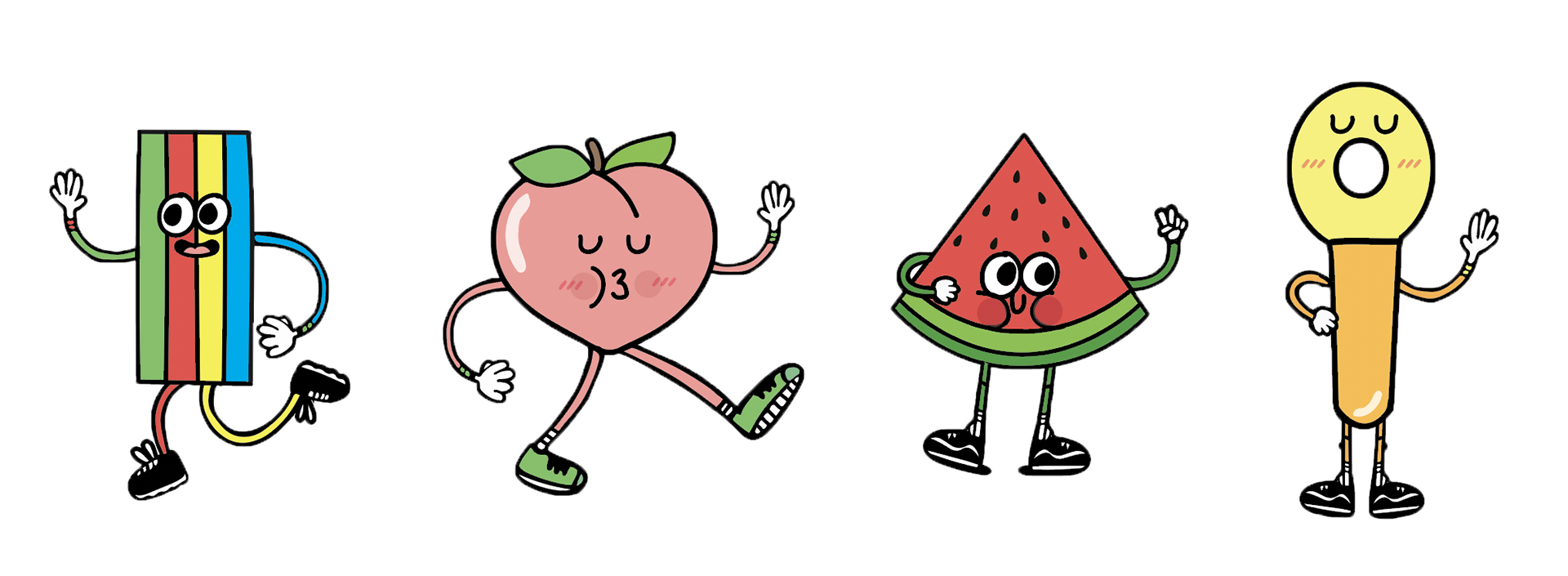
The initial idea was to create some characters that would add some personality and quirkiness to the packaging. I illustrated four different cartoons that represented each of the candy you'd find in a "Dank Pack", rainbow strips, fuzzy peaches, watermelon gummies and sour keys. They evoke a friendly and approachable vibe that also mirrors their brand image.
FINAL DIRECTION


The final design direction ended up being more subdued and clean. The illustrations are subtle and simple yet still impactful when paired with the big and bold typography. They add a nice touch to the overall look and feel of the packaging. The pattern is very versatile and can be utilized across many different design layouts and other marketing materials.